I love to meander through a bookstore looking at the cover art and reading the titles. Does a person who loves to read ever NOT enjoy that? I cringe, though, when I see a book whose cover has been very poorly designed. I wonder if the author designed it themselves, had their sister’s friend’s aunt design the cover, or WHY nobody let the author know that the design was really terrible.
Fortunately, at Worthy Marketing Group, we work with a lot of authors who have beautifully designed books, and on some occasions, we get to help with those designs. A current client, Lisa Kohn, is releasing her book, to the moon and back, in September, and our very own Jayme Johnson, designed the final cover.
the process
Often an author comes to us with something in mind: ideas, a vision, some photographs, or maybe even some design work that’s been started by a firm or (yes) by someone’s sister’s friend’s aunt.
Our client Lisa Kohn came to us with cover drafts from her publisher and asked us to weigh in as a team. Some publishers design in-house, but some allow you to go outside for design ideas, or have a budget for you to hire a designer. Lisa’s publisher allowed her to hire a designer. We provided some samples of other books we’ve designed and shared our vision and feedback about what Lisa already had as options.
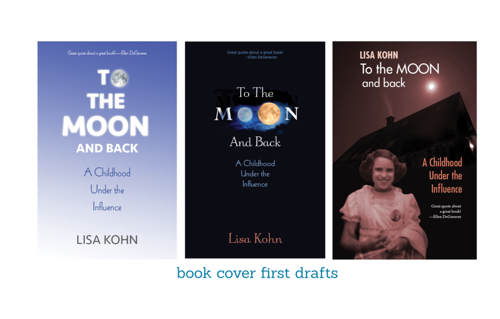
These were the three initial covers provided by Lisa’s publisher:
context clues
To provide a little context, Lisa’s book, to the moon and back, is a memoir about being raised in and torn between two conflicting, bipolar worlds – the fanatical, puritanical cult of the Moonies – and the world which was based in sex, drugs, and the squalor of life in the 1970’s in the East Village of New York City.
So, as a play on “Moonies” the covers Lisa had initially, symbolically displayed the moon — but since that was not really the story, we decided it was not the best image.
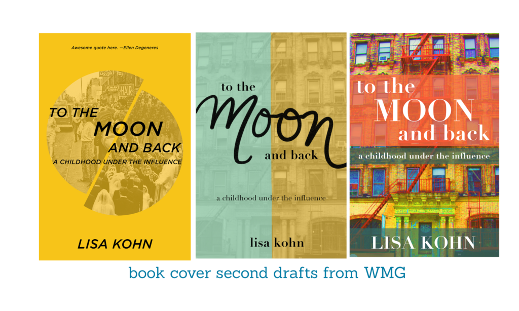
We explored several different styles – more modern, more literary, representing NYC, and ultimately landed on something evoking the 70’s NYC vibe or something that depicts the two opposing worlds as being far more interesting and doing the best job of “telling” the story on the cover. We wanted to nail something better — which is what Lisa’s story deserved.
We provided Lisa with a few initial concepts:
We had three vastly different approaches here, and Lisa thought these moved us into a cool direction, so do you know what she did?She took them to local bookstores and asked the employees. Genius! Who better knows what grabs the attention of all the readers. She also sourced opinions of a couple of friends who had design backgrounds.
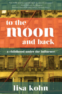
We incorporated ideas about the font, shifted some colors, and had fun deciding what worked best with Lisa’s vision for the book and THIS is the final product.
watch WMG CEO jayme johnson
discuss book covers and her design process on a recent Facebook Live:
4:55 When publishers don’t get the cover designs just right and some creative ways to persuade your publishers on changing your cover design to something you like better.
6:56 Why publishers might provide pushback on your book cover.
7:24 Some very valid reasons you should fight for your book cover.
8:06 What the publisher’s response might be when you’re fighting for your book cover and some sacrifices you might have to make.
9:31 What you should do if you don’t feel like you don’t know enough about book cover design.
10:56 The process of designing a book cover.
12:29 The process of designing a book cover with visuals of some book covers from publishers.
15:47 Additional details of Jayme’s book covers.
Like what you’re reading? Then opt-in to get the Worthy Wednesday newsletter, a monthly updating featuring the latest tips and tricks to help you get your Worthy message out to the world.


Trackbacks/Pingbacks